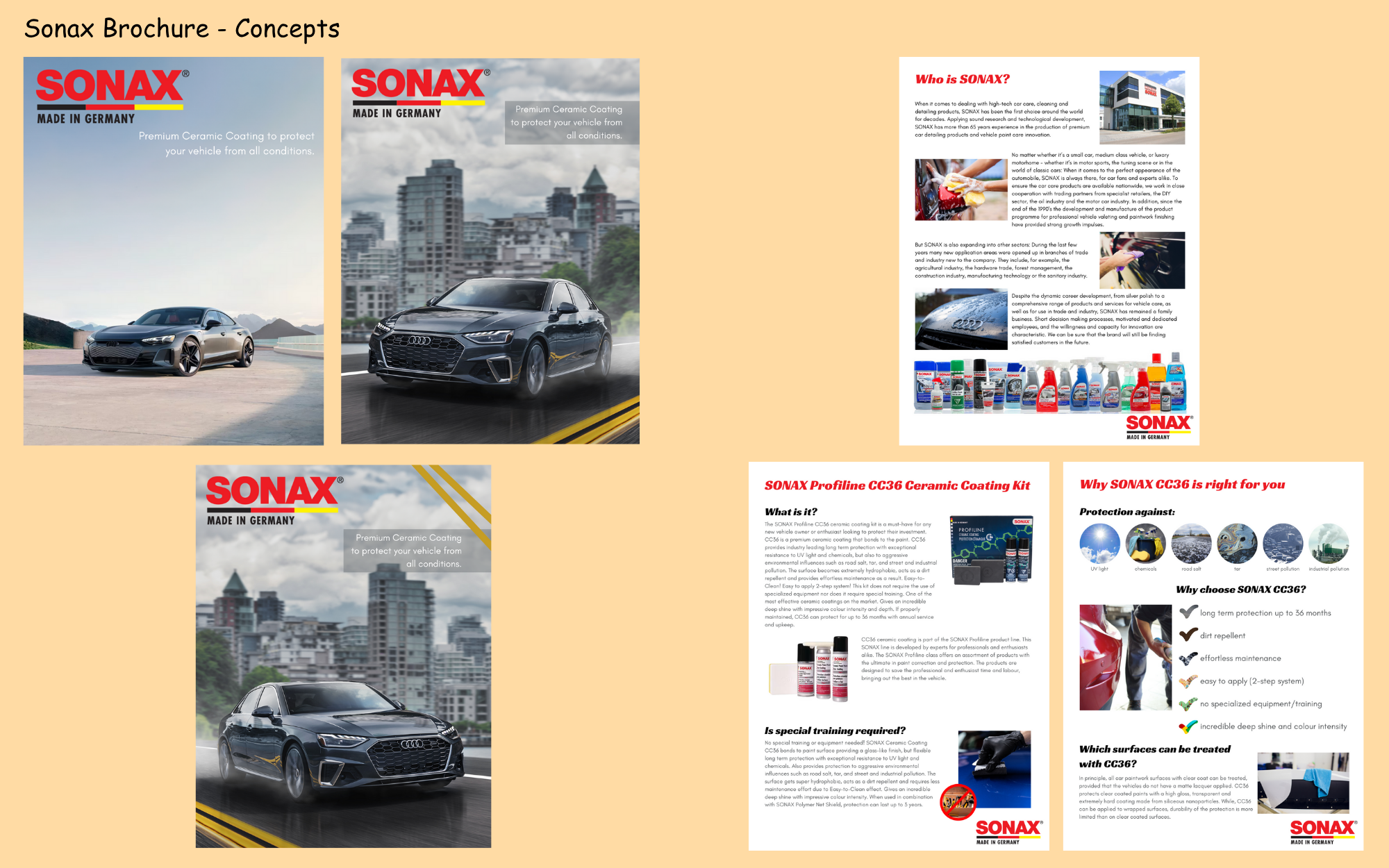
Sonax Premuim Ceramic Coating Brochure
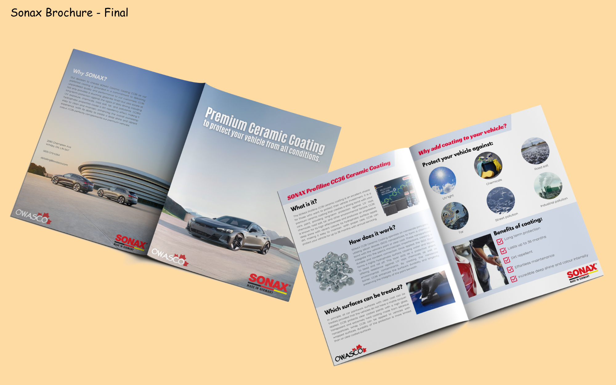
Sonax is a company that specializes in making products for cleaning and caring for your vehicle. When we at Owasco started carrying SONAX Profiline CC36 Ceramic Coating at our collision and repair centre, I was tasked with creating an 8.5×11-inch booklet informing customers on this new product. The objective was something sleek, sophisticated, and easy to understand. The booklet informs customers on what the product is, how it works and what it works for, and the benfits of us using this product.
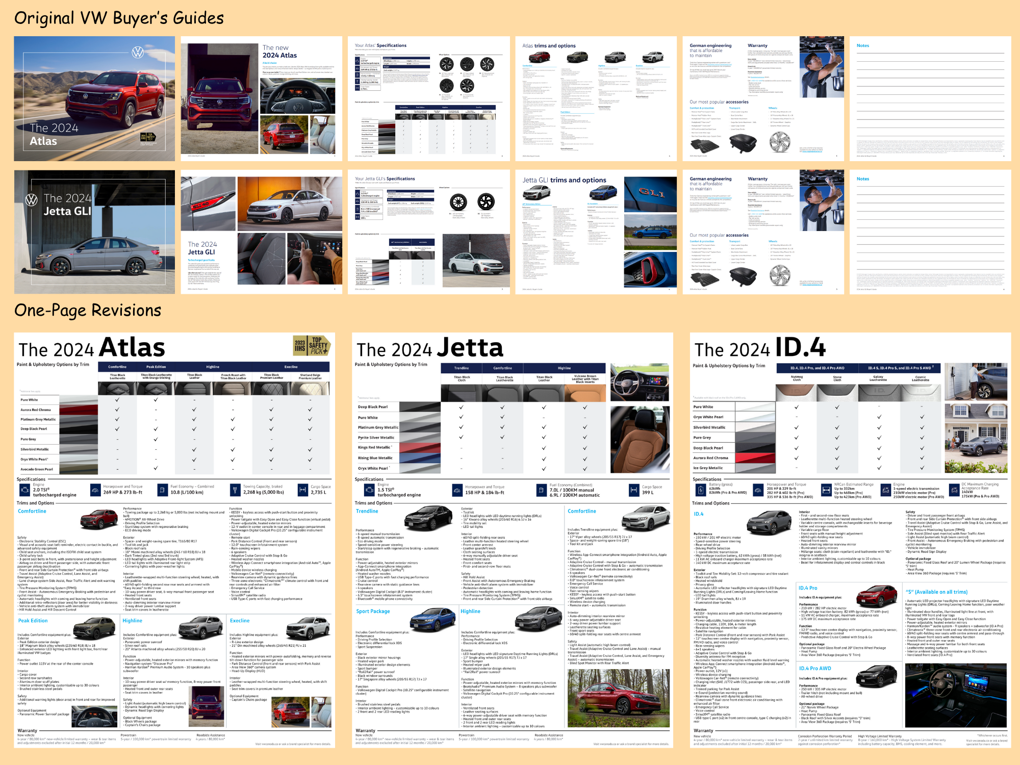
Volkswagen Buyer's Guides
Since 2019, Volkswagen has been creating 6-page information booklets for each model, outlining key features and options. While helpful, these can be overwhelming to skim.We wanted to condense this information further, into a one-page 8.5×11-inch information sheet that could stand beside each model in the showroom. Firstly, I had to figure out what the most important info that consumers need to know first. Next, lay it out in a way that fits all the information while trying not to be too overwhelming. After a fair bit of tweaking, I was able to come up with a final layout I was happy with, and then used similar layouts for each model – not all vehicles had quite the same information so that makes each Buyer’s Guide unique.
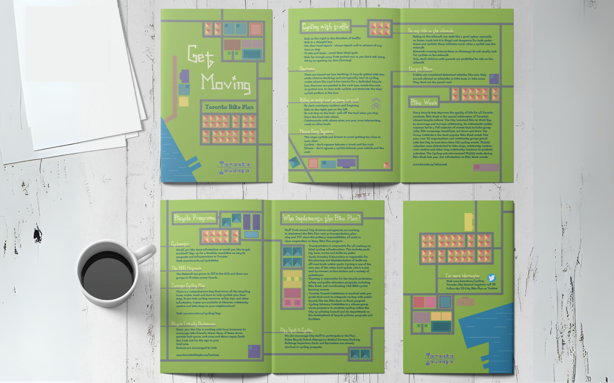
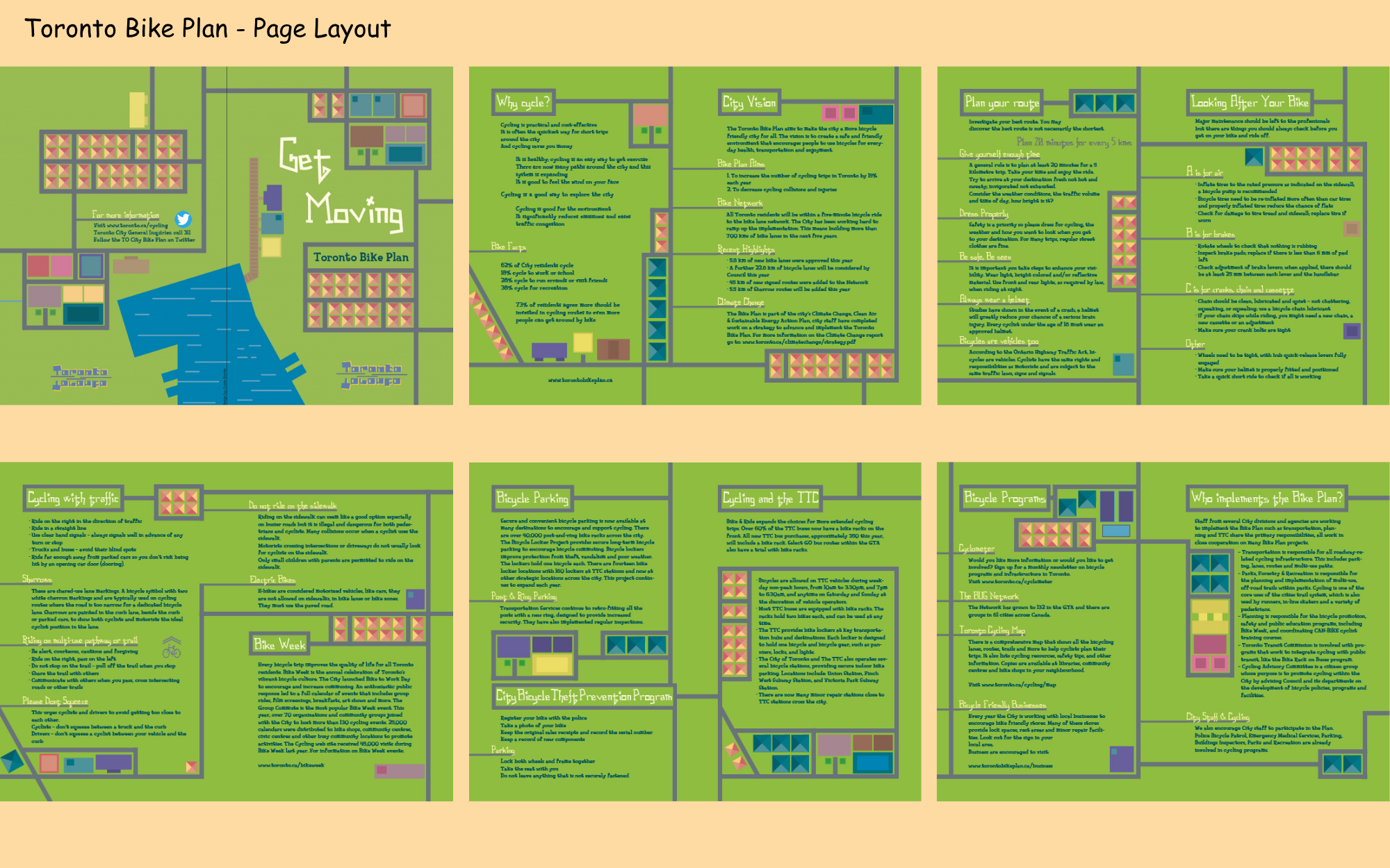
Get Moving - Toronto Bike Plan
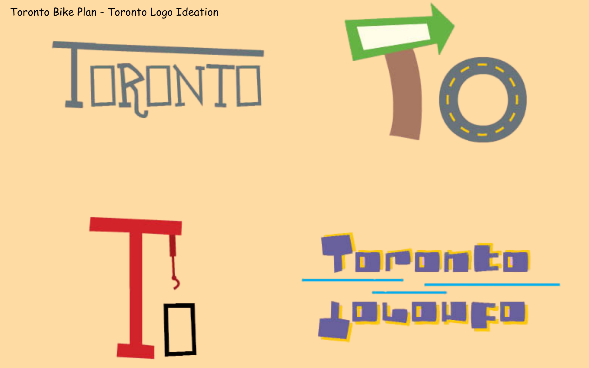
The goal was to create a pamphlet encouraging Toronto residents to ‘get moving’. To help reduce carbon exhaust fuels, we are encouraging citizens to consider biking to their destination, rather than driving. This booklet informs people about the benefits of cycling as well as some helpful tips to know while biking. I chose to use a sort of map template to frame my design, including roads that act as underlines and focal points. I wanted to make it feel energetic and inviting, while also being bright and eye-catching.
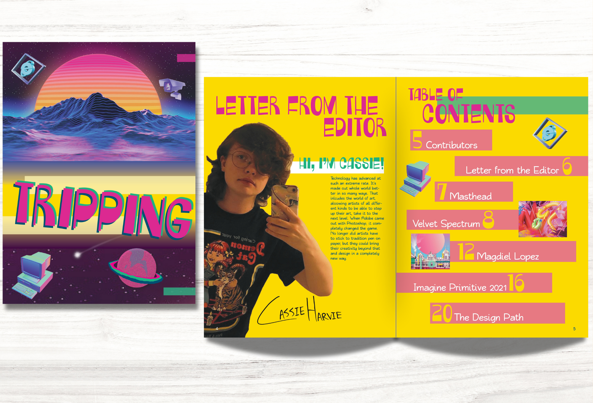
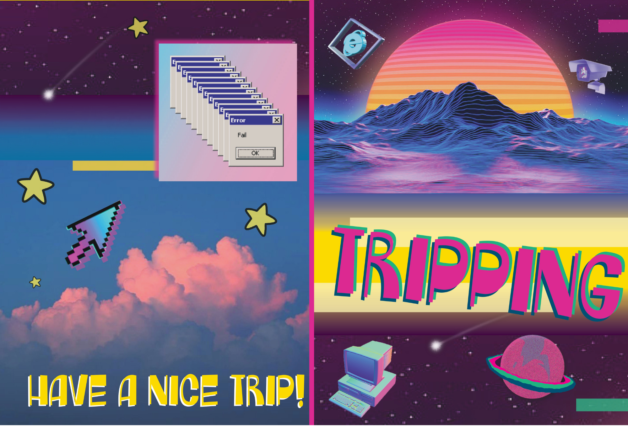
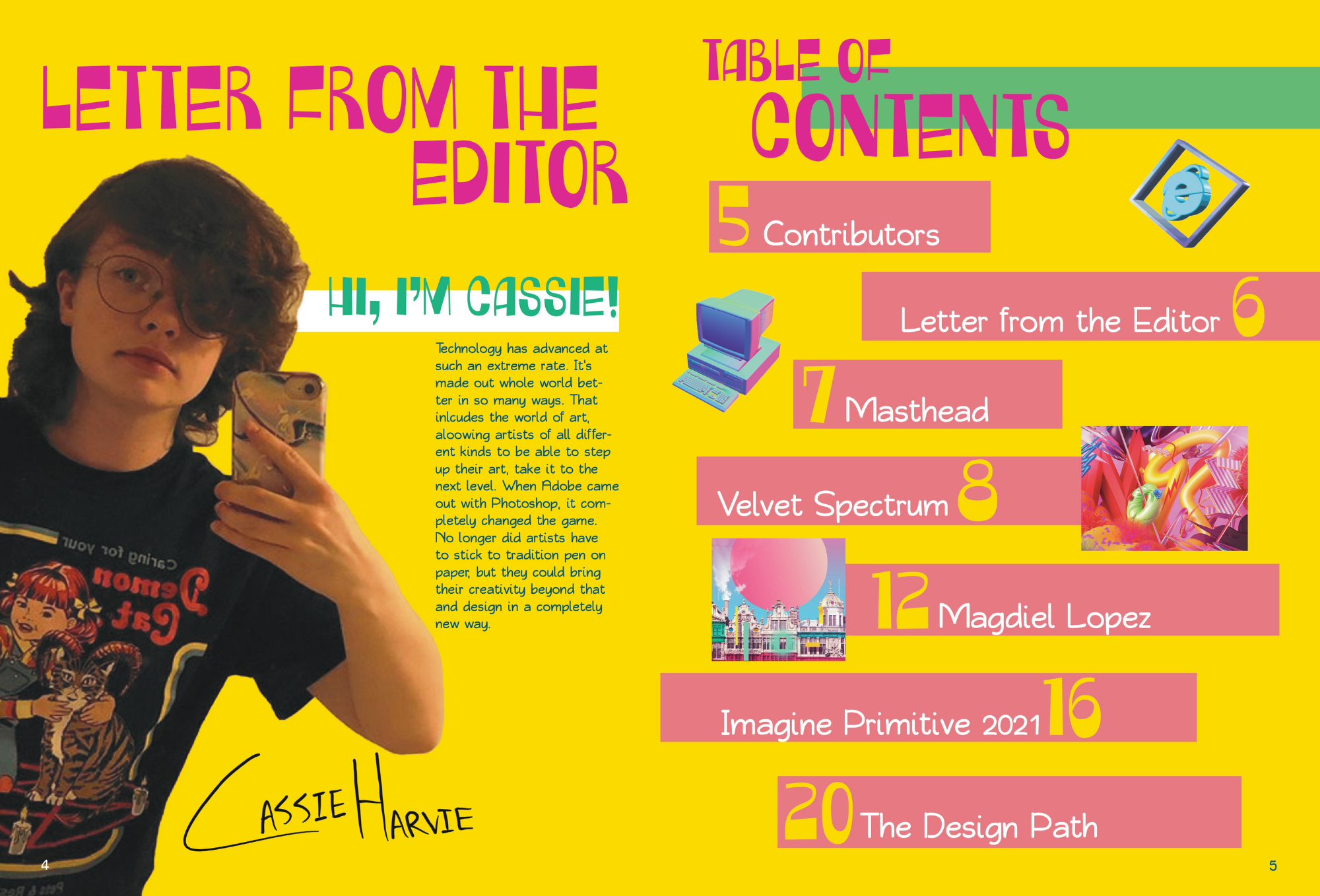
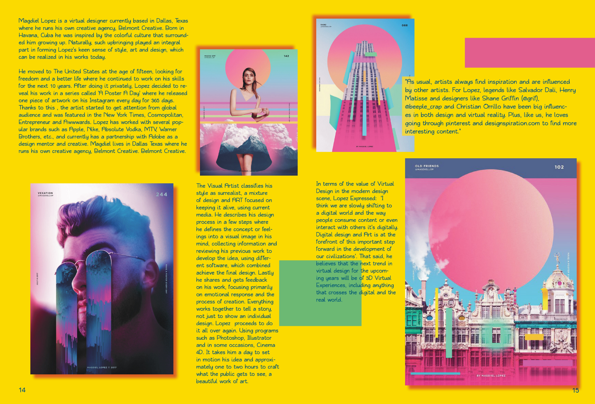
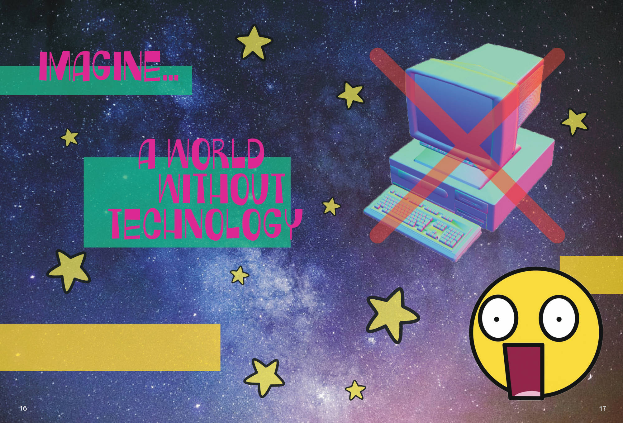
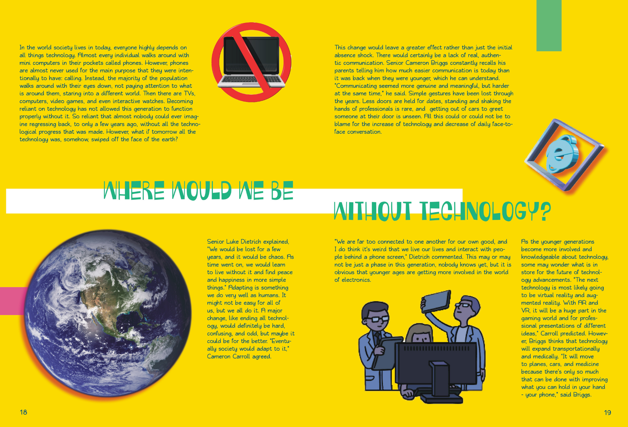
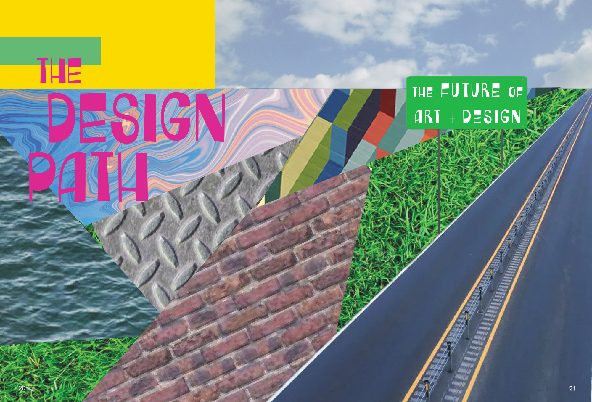
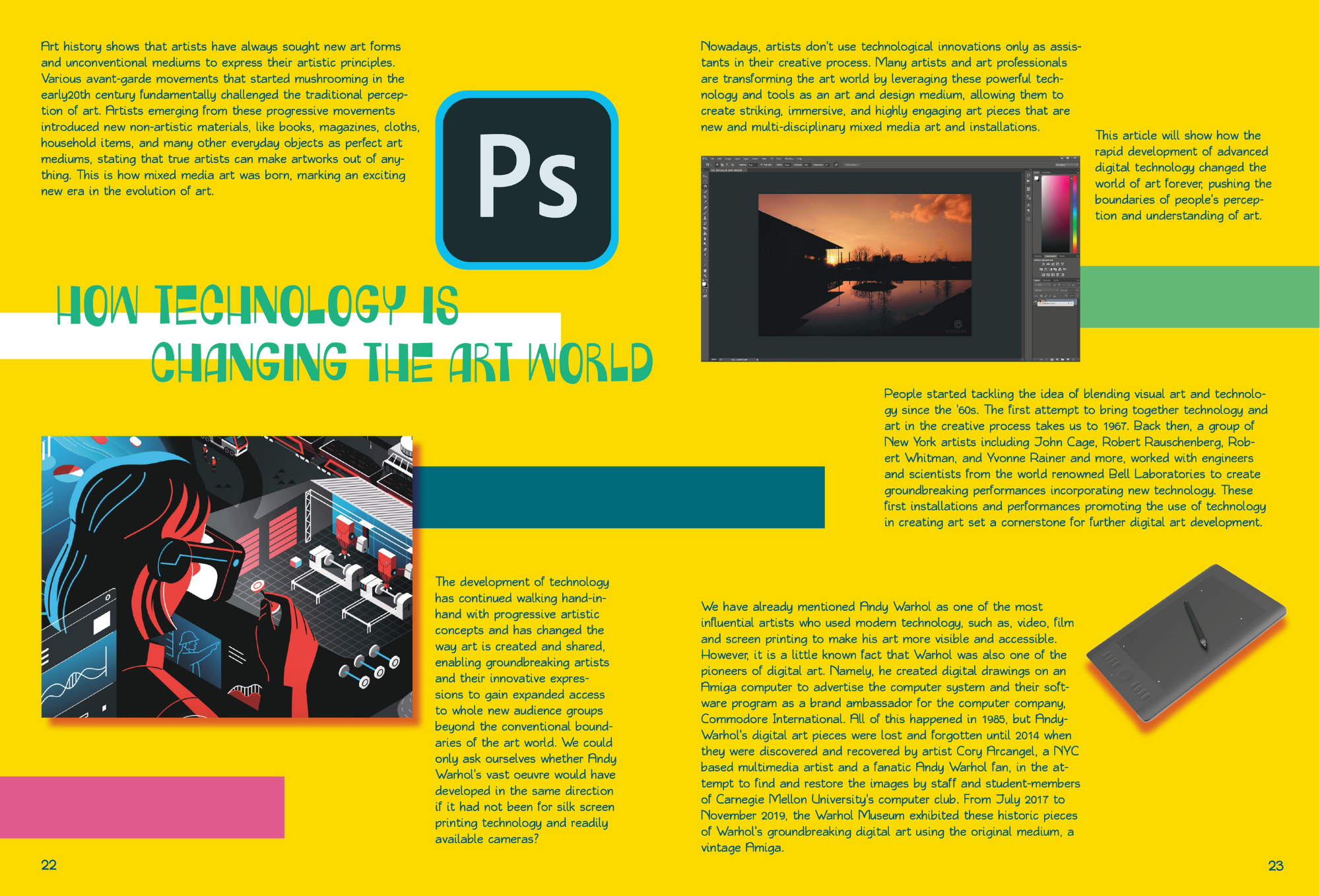
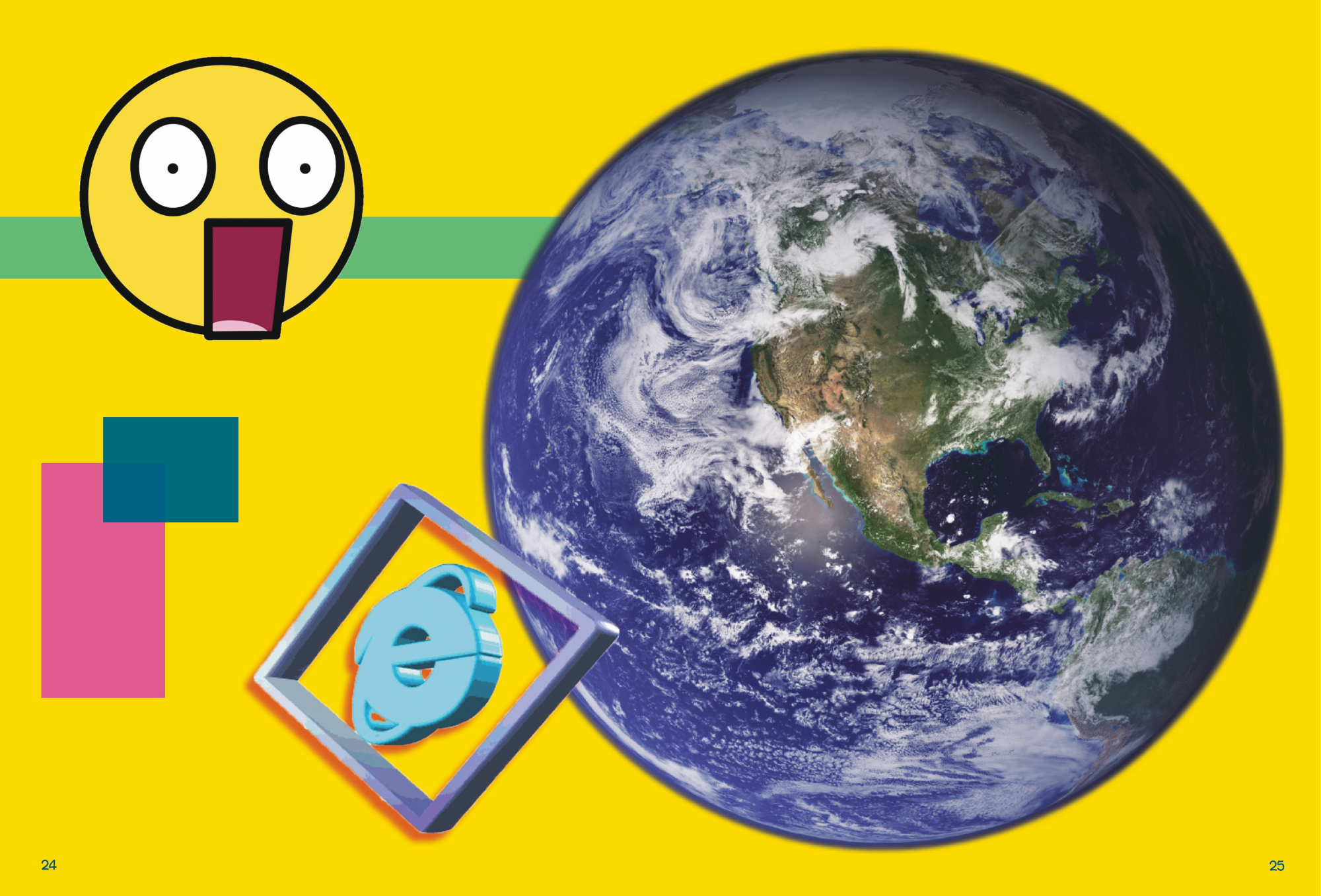
Tripping - A Magazine
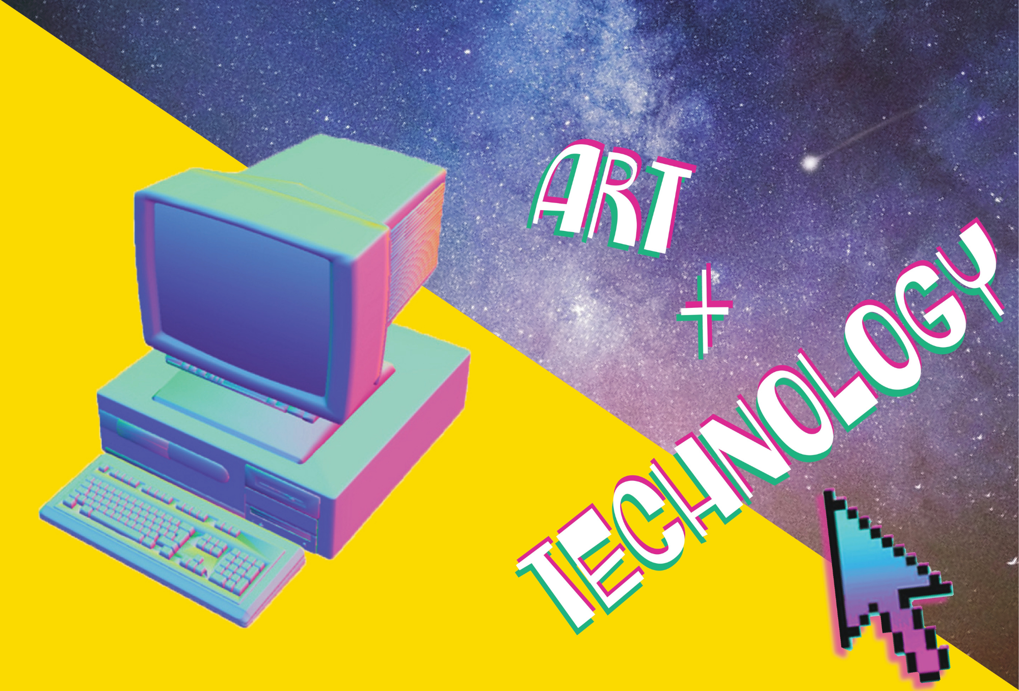
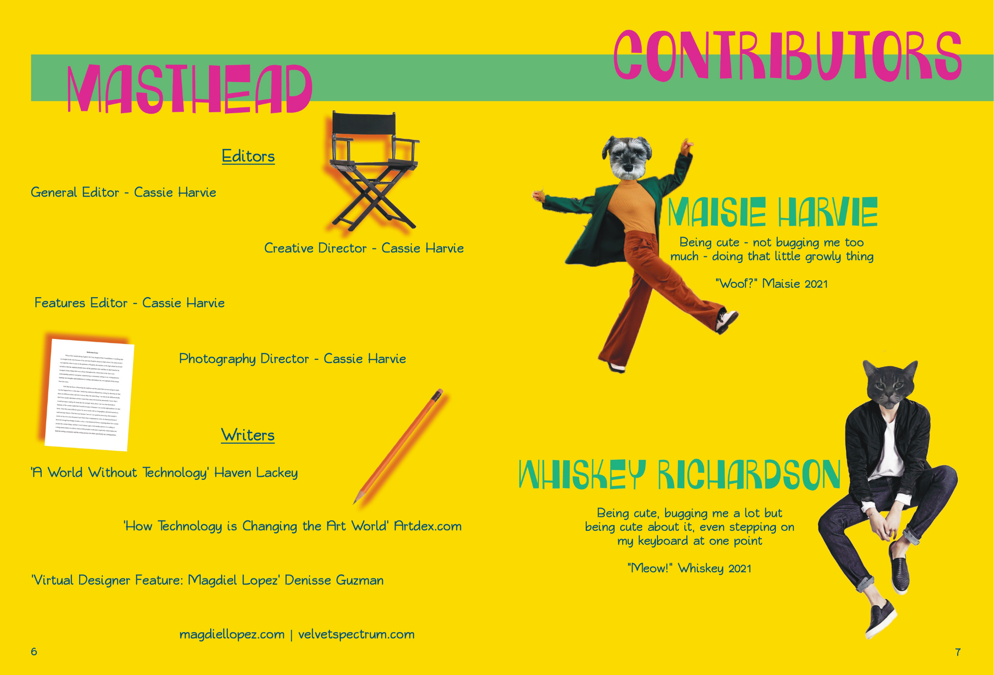
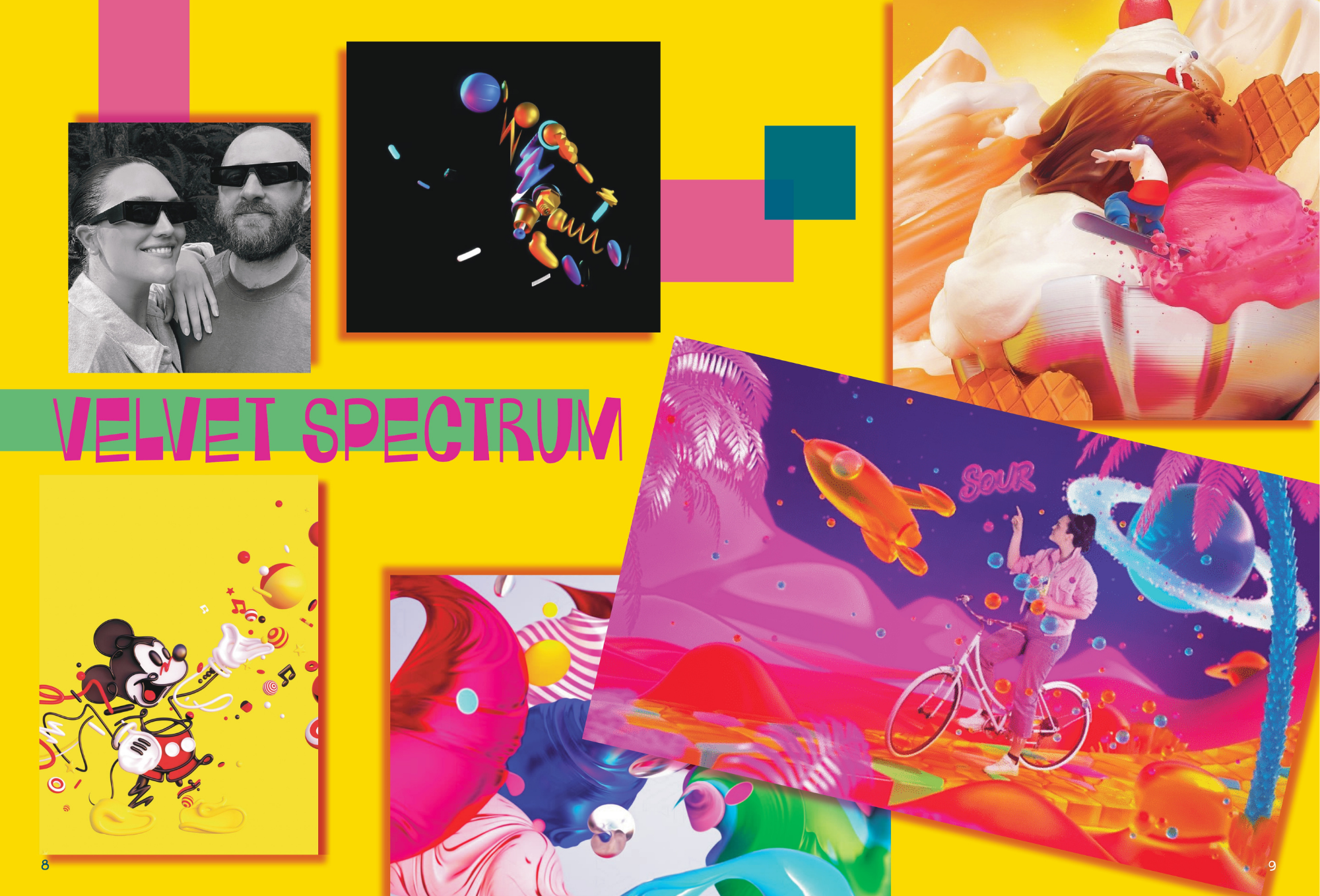
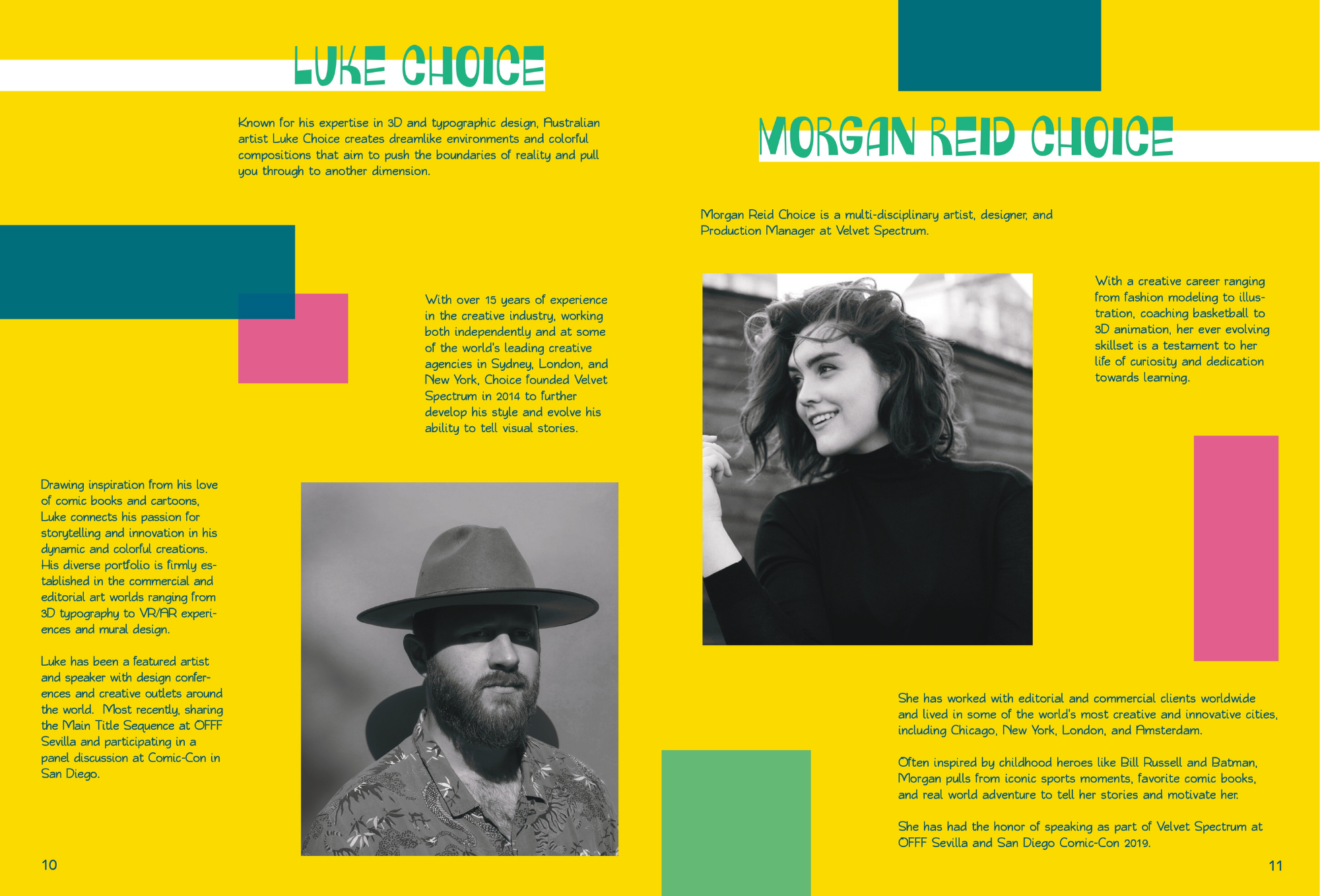
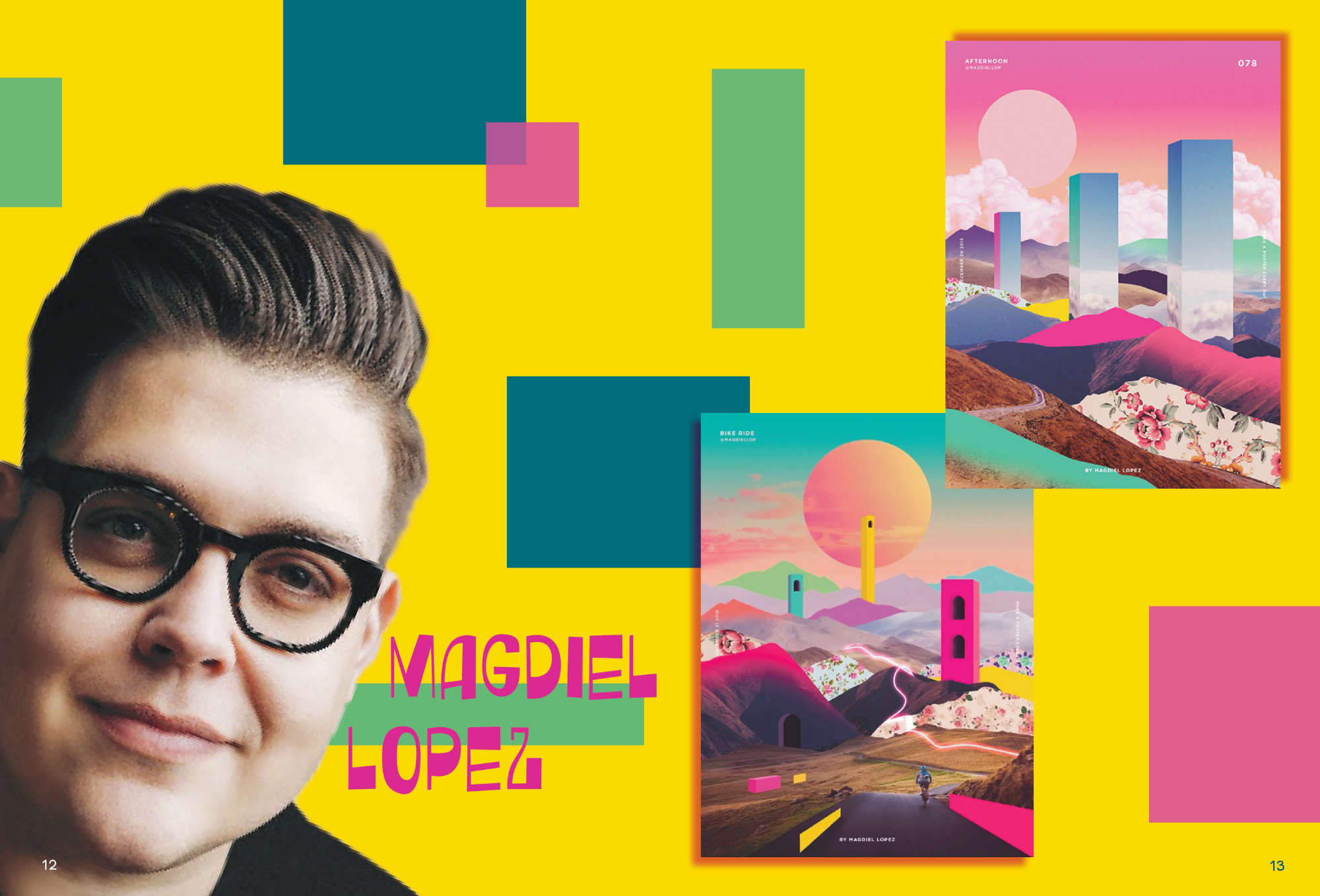
This 28-page magazine is a bold look into how technology and art work together – while featuring two artists who showcase how these features can work co-dependantly with one another. This magazine, made in InDesign, uses bright, eye-catching hues of yellow, pink, green, and blue to draw people in, and is inspired by the artists I feature, Magdiel Lopez and Velvet Spectrum. This was a project I completed in my fourth semester of College, and one of my favourite to work on as I had a lot of fun playing around with the layout and creating something unique and bold.
